
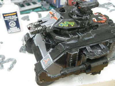
Ah, this guy and his ‘ironic nazi’s’. All the stuff from the other Nazi thread applies with some fun additions. I think this quote is the most illustrative of the situation:
I'm trying, in case your wondering, to be ironic. While the look invokes what we associate with ultimate evil, the Kriegmarines show both individuality and humanity in having their names on their base and "regular human" nose art on their tanks. Their fluff further reinforces this point. They are intended, even if it's just in my head, to mock the concept of perception as it relates to the Warhammer 40,000 universe, how images we associate with Good get corrupted.
I’d say this guy might quality as an “art fag” even if his art isn’t worth a ½ a crap. Now I know beating up on someone’s hobby may be a bit rough to some, but let’s face facts – these are his SS uniform marines - an even worse concept (Now, with extra fan fiction!) than the first accidental Nazis. On top of that, a terrible execution to go with it. Big idea, bad attempt. Other fun things to note: capital G on good, no definition of the what 'Good' is (were the Nazi's good and/or corrupted?), artistic happenstances shoehorned into a last minute intellectual framework, an easy out in case people don't 'get it' and some flim-flam about humanity.
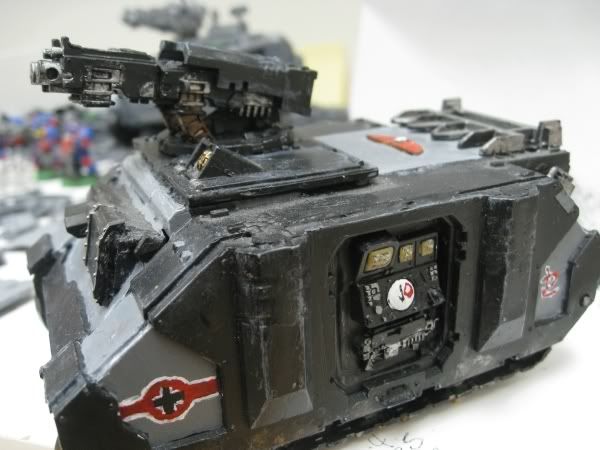
Now, while GMMstudios was a dumb-ass for seemingly not considering the implications of Nazi iconography and blond Imperial Guardsmen, this guy is a retard for not only realizing the implications, but going through with it anyway. I wonder why people wouldn’t get the subtle message of painting SS insignia on tanks. I got news for ya buddy: the irony you are talking about is some kind of retard hipster irony - not real irony. Its just more bullshit. Stop taking clues from your indie art scene friends.
 Now I’ve been 'subtly' ripping on this guy’s artistic talents – the awful highlighting, dubious conversions and the abysmal greenstuff are all there – but you don’t get better without practices. Hell, my early models are just absolutely awful. Just please practice without trying to be esoteric or at the very least without making heavy use of… just off the top of my head here… the goddamn Nazis.
Now, open-sketchbook does raise an interesting point:
… I like the dramatic look and feel of the red, black, and white colour scheme…
Later on, he also admits that maybe he can see where people are coming from with the whole "your Nazi marines are a shame." and changes his symbol.
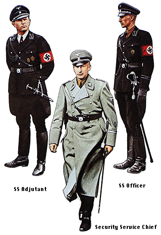
 Yes, the WW2 (Nazi) Germany uniforms and iconography are very striking. I fully agree. The symbols are bold and powerful, the uniforms are sinister – everything has this hard, militaristic edge on it that is absolutely amazing. Resolute, forceful, terrifying all come to mind as well. I think that may be why a ton of people get lured into trying to appropriate some of it- they’re just trying to gain a little of that power. However, these things are also absolutely unmistakable. You use a Nazi-esque symbol and you gain only some of that power while getting a much larger amount of the stigma.
No comments:
Post a Comment